When It Comes To Arranging Furniture
There’s definitely more than one way to do things, but that doesn’t mean you can’t make mistakes. Home decorating is a recognised art, requiring careful calculation of both the space’s needs and the host’s tastes. While experts agree the surest way to a flawless room is trial and error, there are a few rules to keep in mind as you design your setup. So read on to find out what three home design pros say are the tricks of their trade.

1. Area Rugs Belong Under Furniture
Former HG TV host and celebrity designer Angelo Somalis says that “you want to expose some flooring, but for the most part, go big—almost as big as the seating area, or whatever area you’re working with.” An under size rug will make a small room seem smaller and a large room look disconnected. Place the rug underneath at least the first set of legs of your bed, couch or chairs to create a cohesive look, he explains. Los Angeles–based celebrity designer Nicole Sassanian agrees: “Rugs typically look better when all the furniture is on them.”

2. Couches Should Be Surrounded by a Little Space
“Placing a couch even a few inches away from the wall will create a little breathing room and make a space seem larger,” Surmelis says. If you can’t pull it away from the wall because of space restrictions, move chairs or side tables a few inches out to open up the room. If you’re working with a big room, feel free to put the couch in the centre facing a set of windows or a fireplace to break the room into two separate spaces.

3. Light the Entire Room
"Lighting is one of the most important elements in a space,” says HG TV designer Erinn Valencich, who has appeared as the style expert on E! and Access Hollywood. “And placement should maximise light in the room.” Spread light sources around a space, she explains, and make sure every corner gets equal attention. Surmelis agrees: “You want to keep it balanced,” he says. If you have a lamp next to your bed, place two more strategically in the room to create a triangle of light. Surmelis also suggests choosing a taller lamp to emphasize—or create a sense of—a high ceiling.

4. Beds Are the Main Focus
Bed placement should acknowledge the focal point of the room, says Valencich. “If your room has French doors, place your bed opposite them.” Or use an available corner nook. Having a small room presents a big challenge for bed placement, warns Surmelis, but placing the side of the bed against the wall is a good option.
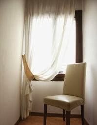
5. The Higher the Curtains, the Better
“Go as high as you can possibly go,” Surmelis says. Sassanian agrees: “In most situations, it’s best to hang drapes from the ceilings to the floors—it makes the ceilings seem a lot higher and expands the room.” If you go too small—either the curtains are too short or hung too low—they seem like an afterthought, Surmelis explains. You should also hang curtains 1 to 2 feet beyond where the casement ends to make the window looks wider.

6. Dining Room Tables Go Under Overhead Lights
Though it depends on the architecture of your home, for dining tables, Surmelis always suggests the classic placement in the centre of the room under a light fixture. If your dining room chandelier is slightly off-centre, you can try looping the excess chain it hangs from onto a hook that is positioned so the grouping will work. But, in most cases, Surmelis explains, if the light is off-centre or your room is too small for the traditional arrangement, you shouldn’t try to force it. “Do something fun, like placing it against the wall and creating bench seating.”

7. Coffee Tables Should Be Large
“Go as big as you can,” Surmelis says. “If you can’t go too big because you have a narrow living room, then go skinny but long.” Like rugs, a large coffee table can help expand and connect a room. An oversize table contributes more to a room in terms of both function and aesthetics, Valencich adds, and all experts agree that coffee tables should be placed anywhere from 12 to 24 inches away from your couch.

8. Dressers Are Not Stand-Alone Pieces
Dressers belong—and look best—up against a wall. All experts agree angling a dresser in the corner not only looks bad, but wastes space. “Placing a dresser in a corner creates a weird, dead space behind it—like a black hole,” Valencich says. She suggests centring a dresser on a wall. If placing it off-centre, put another piece of furniture next to it to achieve balance, she adds.

9. Hang Paintings and Mirrors in Relation to the Rest of the Furniture
“People have a tendency to hang pictures too high,” Sassaman says. Wall art should ground everything around it. So when putting it over a piece of furniture, hang it 24 to 36 inches above, though that rule varies depending on the height of the artwork itself. Before you make any holes in the wall, try this trick: Use the paper insert provided with a frame (or a newspaper cutout) to figure out the best placement. Put it on the wall and move it around to get a feel for how the piece will look in the room. Apply the same rules when placing mirrors, which are best hung opposite something you want to see more of—such as beautiful wallpaper or windows to bring in more light.

10. Televisions Aren’t the Main Attraction of a Room
It’s best to hang the TV on the wall to save space, but if that’s not an option, use the focal point of the room as a reference when picking a spot. “You don’t want to ignore the fireplace or something else that would architecturally be a natural main element in the room,” Sassaman says. “It benefits the layout to group main items together.”


0 comments:
Post a Comment